
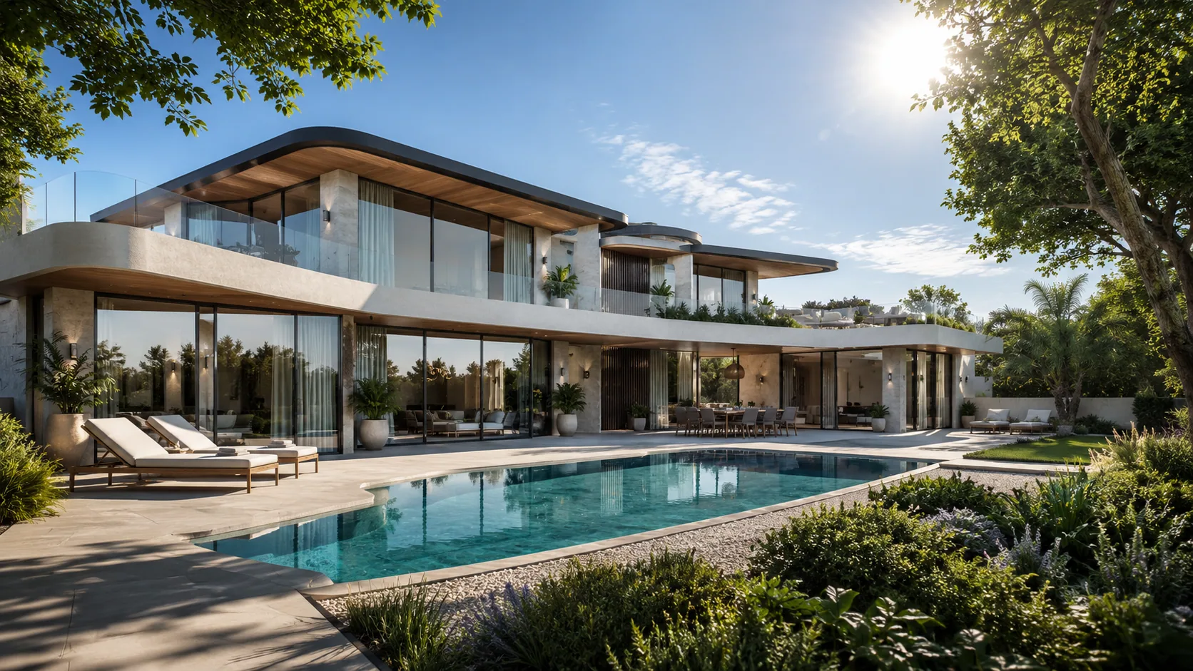
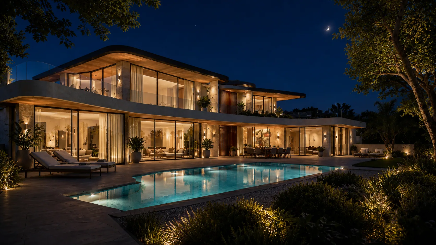
2026 Color Trends: The Palette of Quiet Luxury in Interiors
The color of 2026 comes not from spectacle but from stillness: warm neutrals, earth tones and the serene palette of quiet luxury. We rank the year's color families and timeless combinations through an expert lens.
The 2026 color trends point in a single direction: serenity. The year's palette moves away from vivid, attention-grabbing tones toward the warm neutrals, earth tones and calm colors of quiet luxury borrowed from nature. Warm beige and sand, sage and olive green, terracotta, smoky anthracite and deep burgundy accents are the leading families. The logic is simple but powerful: a neutral base across broad surfaces, deepened with limited and deliberate accents. In this article we unpack the year's color families one by one, establish the material-color relationship, and propose a timeless palette for luxury villa and hotel projects.
The color sensibility of 2026 reflects a maturing. The years dominated by cold grays and sterile whites are behind us; their place has been taken by warm tones close to earth that soften the light. The palette is now built not to fill a space but to calm it. This is also the color equivalent of quiet luxury: a world of color without logos, without noise, drawing its quality not from contrast but from harmony. Tones that grow more beautiful in natural light and never tire the eye throughout the day or the seasons are preferred.
The most defining neutral of 2026 is warm beige and sand tones. Unlike the cold whites that lean toward gray, these tones carry a faint warmth within them; they give a space an inviting, embracing base. Used on walls, on large surfaces and on filler furniture, they soften the light and create a calm canvas on which other colors can settle. This is the backbone of the quiet-luxury palette.
These soft, dusty tones of green are on the rise in 2026. Sage and olive green work like the color equivalent of biophilic design: they bring nature inside, rest the eye and form a flawless harmony with a neutral base. In bedrooms, workspaces and kitchen cabinetry they add a soothing depth; they find their best expression when placed beside wood and natural stone.
Terracotta, tile and clay tones represent the warm pole of the palette. These deep-rooted colors of Mediterranean and Anatolian architecture give a space a timeless intimacy. Used in the right dose as an accent — in a textile, on a plaster surface or in ceramic — they warm the neutral base without overwhelming it. Combined with lime plaster and handmade ceramic, they create one of the most characterful touches of 2026.
Anthracite and smoky tones establish the center of gravity of the palette. These dark grays give depth without the harshness of black; used in joinery, kitchen islands, fireplace fronts and architectural frames, they form a strong yet sophisticated contrast against warm neutrals. Used sparingly they are luxurious; used in excess they weigh a space down — striking the right balance is essential.
The boldest family of the 2026 palette is deep burgundy, wine and burgundy-brown tones. These rich, mature reds add a dignified richness to a space rather than enlivening it. Used on an accent wall in a dining room, on a velvet armchair or in a library detail, they create a sophisticated focal point. Because they are akin to earth tones, they never feel foreign to the base.
The family that balances the cool side of the palette is the dusty, soft blues — not sky blue so much as misty, grayed tones. In bedrooms and bathrooms they bring calm and open a refreshing breath beside the warm neutrals. In 2026 blue is positioned not as vivid and saturated but as a calm, almost neutral accent.
The secret of the 2026 palette lies less in the colors themselves than in their proportion. The classic, working rule is this: a large portion of the surface a calm neutral, a secondary tone, and only a small percentage a vivid or dark accent. This balance makes a space both serene and full of character. Reducing the accent increases the luxury; the more selectively color is used, the stronger its effect.
Color is never perceived on its own; it is read together with the material that carries it. The 2026 palette finds its best expression with natural materials: warm woods like oak and walnut deepen the beiges and greens, travertine and marble add texture to the neutral base, and lime plaster softens the light to give the whole palette a handmade intimacy. When choosing a color, one must consider the texture of the surface and its behavior under light together.
The same palette does not work the same way in every space. A practical roadmap room by room:
- Living room: a warm beige base, walnut wood and a single deep burgundy or sage accent; broad surfaces calm, the focal point selective.
- Bedroom: sand and dusty green or soft blue; a restful, low-contrast harmony that never tires the eye.
- Kitchen: neutral cabinets above, an anthracite island below; a warm-dark contrast balanced by a travertine or natural-stone countertop.
- Bathroom: light sand and soft blue, matte surfaces and natural stone; an airy yet warm spa feel.
- Study / library: an olive green or wine accent wall; a calm yet characterful base that supports focus.
Not every popular color is lasting. Saturated neon tones that flare for a season on social media and fade quickly, overly high-contrast dual schemes, and spaces surrendered entirely to a single fashionable color reveal their date within a few years. The lesson of 2026 is clear: when investing in color, one must look with the eye of a decade, not a season. The timeless does not exclude boldness; it uses it with measure.
A lasting palette knows not the most spectacular color, but how to use the right tone in the right proportion and the right light.
In a villa or hotel project, color is an investment that will live for years; this is why one must distill the most enduring layer of the trend. A warm neutral backbone, one or two soft tones drawn from nature, and a selective dark or burgundy accent — this trio captures 2026 while still looking right a decade later. This is precisely why, at Vesya, we run the process from concept design to execution under a single hand: to ensure that color stays beautiful not only in the render but under real light and over time. If you have a project seeking direction in palette selection, we can evaluate your concept together.
In short
- The 2026 color trends lean toward warm neutrals, earth tones and the serene palette of quiet luxury.
- The year's families: warm beige/sand, sage & olive green, terracotta, anthracite & smoke, deep burgundy, soft blue.
- The working rule is a neutral base + selective accent; the less color, the more luxury.
- Color is read together with material; natural wood and stone deepen the 2026 palette.
How we can help you on this
Journal
 Trends
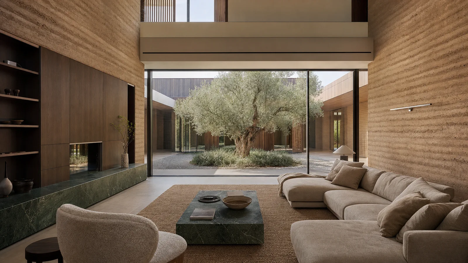
2026 Villa Interior Design Trends: Quiet Luxury and Nature
The luxury line of 2026 runs through calm rather than display: quiet luxury, biophilic design, natural materials and warm minimalism. We separate lasting trends from passing fads.
July 20267 min read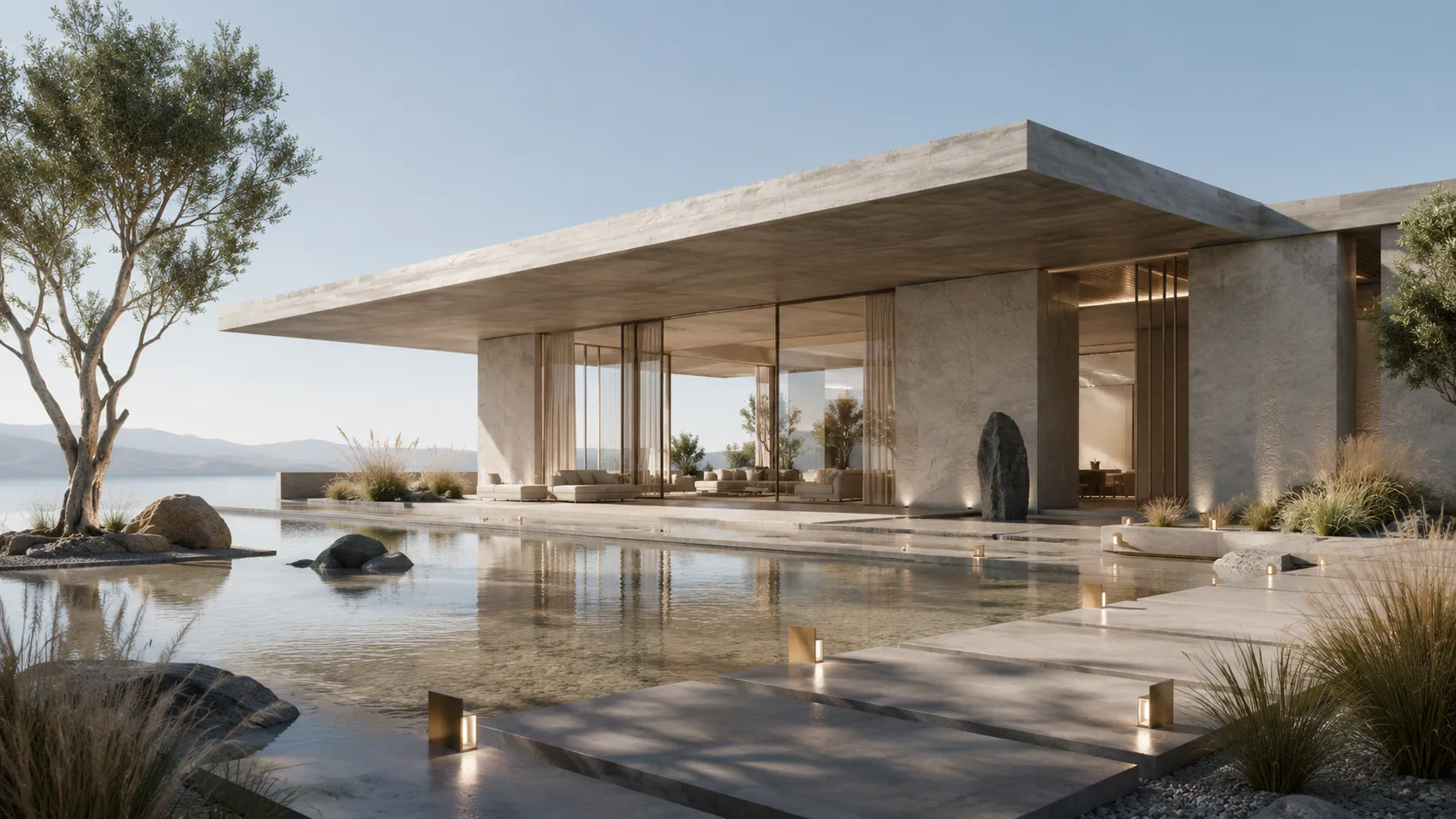 Interior
What Does Anthracite Mean? Definition, Shades and Use of the Color
Anthracite is a deep color tone between dark gray and smoke. It takes its name from anthracite coal. We cover its definition, shades, complementary colors and balanced use in interiors.
July 20266 min read Trends
What Is Minimalism? The Meaning of Simplicity in Interior Design
Minimalism is a philosophy of simplicity that eliminates the unnecessary in interior design while bringing what matters to the fore. We explain the “less is more” principle, its elements and warm minimalism.
July 20267 min readFrequently asked questions
Vesya Project Team
Design · Build · Construction
- Response time
- Same day
- Channels
- Phone · Email · WhatsApp
Can't find your answer here? Send us your question directly — our team will reply shortly.
Free consultationIn 2026 the interior color trend leans toward warm neutrals and earth tones: warm beige and sand, sage and olive green, terracotta, smoky anthracite and deep burgundy accents. The common thread is quiet luxury — not vivid and showy, but a calm, natural palette that softens in daylight.
Vesya Project Team
Rather than a single 'color of the year,' a family stands out: warm neutrals. Within them, warm beige and sand form the backbone, while sage green and terracotta are the most talked-about tones. Deep burgundy and smoky anthracite draw attention as bold yet timeless accent colors.
Vesya Project Team
The working logic is a neutral base plus a selective accent: a large portion of the surface a warm neutral (beige, sand), a secondary natural tone (green or blue), and only a small proportion a dark or burgundy accent. This ratio makes a space both serene and full of character; reducing the accent heightens the sense of luxury.
Vesya Project Team
Warm neutrals work as a base in every space. Earth and green tones give the best result in the living room and study, soft blue and sand in the bedroom and bathroom, and anthracite in the kitchen island and joinery. Keeping bold tones like burgundy limited to a single focal surface is the most elegant approach.
Vesya Project Team
Warm neutrals, earth tones and natural greens rest on a timeless base rather than a trend; used in the right proportion, they stay current for years. What fades quickly are saturated neons and overly high-contrast schemes surrendered entirely to a single fashionable color. A lasting palette uses boldness with measure.
Vesya Project Team