
What Does Anthracite Mean? Definition, Shades and Use of the Color
Anthracite is a deep color tone between dark gray and smoke. It takes its name from anthracite coal. We cover its definition, shades, complementary colors and balanced use in interiors.
Anthracite is a deep color tone between dark gray and smoke, almost approaching black but never quite black. It takes its name from anthracite coal, a hard, matte black type of coal known for its high carbon content. It has become one of the most preferred neutral colors of recent years: it appears everywhere, from facades to kitchens in architecture and from joinery to furniture in interior design. So why is this color so popular, what shades does it have, and how is it used in a luxury interior without overdoing it? In this guide we explain, step by step, what anthracite is and how to use it correctly.
Anthracite is a deep, neutral color tone that sits between dark gray and smoke — close to black but not fully black. It softens the hardness of black while staying away from the coldness of light gray, offering a balanced middle ground. The color takes its name from anthracite coal: anthracite is the hard, matte, deep black type of mineral coal with the highest carbon content among coal varieties. This coal's distinctive dark, slightly metallic gray gradually turned into a color name and today holds its place in the language of design as “anthracite gray.” In short, anthracite is the name of both a material and a color inspired by that material.
Anthracite is not a single color but a family of tones. It takes on different characters depending on the light, the surface and the colors placed beside it. Sometimes it reads as a cool gray leaning toward blue, sometimes as a warm smoke approaching brown. On a matte surface it looks calmer and deeper; on a satin or metallic surface it appears more vivid and characterful. It softens in natural daylight, while in the evening, with warm lighting, it gains an almost velvety depth.
This flexibility is what makes anthracite valuable to designers: the same color can be both a sophisticated backdrop and a strong accent, depending on the atmosphere of the space. That is why, when choosing anthracite, you should think not in terms of a single color swatch but according to the materials and light you will use together with it.
The rise of anthracite is no coincidence. This tone carries the three qualities contemporary design seeks all at once: elegance, neutrality and practicality. It is not as hard and assertive as black; nor is it as vulnerable and sterile as white. Between the two, it strikes a mature and timeless balance.
- Elegance: Anthracite looks sophisticated with no effort at all. It naturally aligns with the modern, minimalist and quiet-luxury line.
- Neutrality: It harmonizes with almost any color and material; it offers a complementary rather than dominant backdrop.
- Hides dirt: Unlike light tones, it conceals fingerprints, dust and everyday marks — a major advantage especially in joinery, kitchens and wet areas.
- Timelessness: It is not a seasonal whim; it positions itself as a lasting neutral that does not go out of fashion over the years.
Anthracite's greatest strength is that, as a strong neutral, it can converse with almost any palette. To establish balance, pairing it with a color that carries warmth or light usually gives the best result. The most frequently effective companions are:
- Natural wood: Woods such as oak, walnut and ash break the coldness of anthracite; they form the warmest and most balanced pairing.
- Beige and stone tones: They soften anthracite's depth and add earthy warmth and calm to the space.
- White: It creates a crisp, contemporary and airy line with high contrast; the classic duo of minimalist spaces.
- Gold and brass: Metallic details shine over anthracite's matte depth; they elevate the sense of luxury and elegance.
- Green: Olive, sage and forest greens form a natural, biophilic and serene harmony with anthracite.
Thanks to its flexibility, anthracite finds a place in almost every layer of a project. On the exterior facade it establishes a modern, strong identity; on doors, windows and joinery it slims and refines the frames. In interior design it stands out most in the kitchen: anthracite cabinet fronts capture a timeless elegance when combined with natural wood and stone countertops.
In furniture, on pieces such as a sofa, a bookcase or a dining table, anthracite gives the space a calm center of gravity. In the bathroom, matte anthracite ceramics, faucets and sanitaryware create a sophisticated, spa-like atmosphere. In short, facade, joinery, kitchen cabinets, furniture and bathroom are the areas where anthracite shines most naturally.
Anthracite unites the power of black with the elegance of gray; when balanced correctly it does not cheapen a space but matures it.
Anthracite's strength is also its trap. Painting every surface anthracite darkens and weighs down the space instead of opening it up; it produces an oppressive gloom rather than a sophisticated depth. Good design uses anthracite not as the dominant color but as a strong anchor. It needs to be balanced with warm wood, natural stone, textiles and plenty of natural light.
A practical rule: use anthracite as an anchor on one of the space's large surfaces (for example a kitchen island, a run of joinery or a single wall), then let it breathe with light and warm tones. Choosing a matte surface increases depth; while pinpoint metallic details break the monotony. When balance is achieved, anthracite does not shrink the space — on the contrary, it gives it a mature character.
In the context of luxury, anthracite is a color that comes from maturity rather than show. It fits the language of quiet luxury exactly: it does not shout, it reveals itself slowly. When paired with the right material and light, it adds depth, calm and timeless elegance to a villa interior. The natural wood extending behind anthracite joinery, the gold detail falling upon it and the wide glass surface facing it — it is this layering that lifts anthracite out of an ordinary dark gray and turns it into a luxurious identity.
At Vesya, in our villa and hotel projects, we treat anthracite not as a standalone color choice but as part of a holistic concept. Because we carry out design, material selection and application under one roof, the right shade of anthracite comes to life on the right surface and in the right light. If you would like to talk about how anthracite should be positioned for your own space, you can start with our concept design process.
In short
- Anthracite is a neutral color tone between dark gray and smoke, close to black but not fully black; it takes its name from anthracite coal.
- It owes its popularity to its elegance, neutrality and dirt-hiding practicality; it positions itself as a timeless neutral.
- Its best companions are natural wood, beige, white, gold and green; it needs to be balanced with warmth and light.
- Used as an anchor color without overdoing it, it adds depth and a mature luxury character to the space.
How we can help you on this
Journal
 Interior
What Does Decor Mean? Its Meaning, Elements and Difference from Decoration
Decor is the whole of the visual order that gives a space its character. We clearly separate the concepts of decor, decoration and interior architecture and explain the principles of good decor in expert language.
July 20267 min read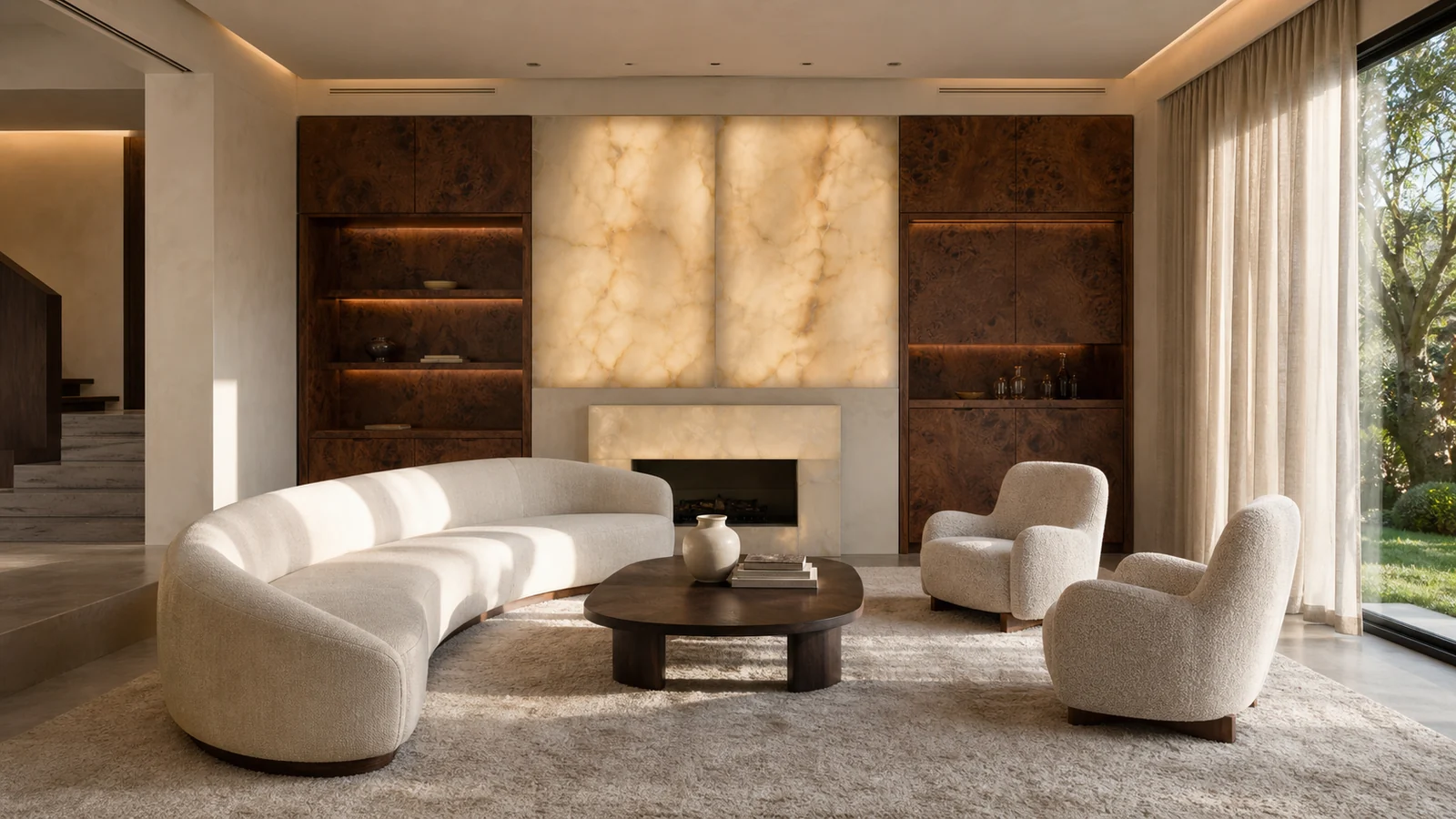 Interior
Luxury Villa Interior Design: Material, Texture, Light and the Grammar of Quiet Luxury
What makes a villa "good" rather than merely "expensive" is honesty of material, consistency of texture and the staging of light. We spell out the grammar of quiet luxury, line by line.
July 20268 min read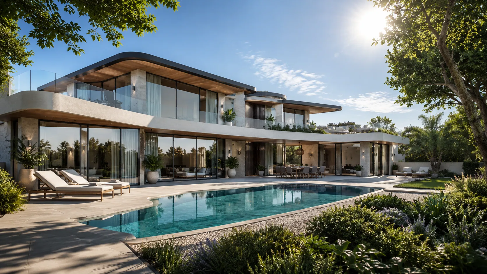 Trends
2026 Color Trends: The Palette of Quiet Luxury in Interiors
The color of 2026 comes not from spectacle but from stillness: warm neutrals, earth tones and the serene palette of quiet luxury. We rank the year's color families and timeless combinations through an expert lens.
July 20267 min readFrequently asked questions
Vesya Project Team
Design · Build · Construction
- Response time
- Same day
- Channels
- Phone · Email · WhatsApp
Can't find your answer here? Send us your question directly — our team will reply shortly.
Free consultationAnthracite is a deep, neutral color tone that sits between dark gray and smoke — close to black but not fully black. It takes its name from anthracite coal, a hard, matte type of coal with the highest carbon content. In the language of design it is usually referred to as “anthracite gray” and is used as a contemporary, sophisticated neutral.
Vesya Project Team
Anthracite is a tone belonging to the dark gray family. It is darker than gray and softer than black; it has a smoky character. Depending on the light and surface, it can read sometimes as a cool gray leaning toward blue, sometimes as a warm smoke approaching brown. This flexibility makes it a strong and harmonious neutral.
Vesya Project Team
Since anthracite is a strong neutral, it harmonizes with almost any palette. It gives the most balanced results with natural wood, beige and stone tones, white, metallics such as gold and brass, and green tones. To break its coldness, it is generally recommended to pair it with a color that carries warmth or light.
Vesya Project Team
Gray is a general color that covers a wide range of tones from light to dark. Anthracite, on the other hand, is a special gray tone at the darkest end of this range, close to black and with a smoky character. In other words, every anthracite is a gray, but not every gray is anthracite; anthracite is the deepest and most dramatic form of gray.
Vesya Project Team